Promotional Balance Management
Designing a White-Label Flexible Payment Experience for Citi's Retail Partners
* Visuals shown are intentionally redacted or low-fidelity to honor NDA obligations with Citi. Detailed walkthroughs available on request.
What started as a single-partner payment flexibility feature for The Home Depot became a white-label platform serving 20+ Citi retail partners designed, led, and delivered from discovery through engineering handoff.
R O L E
Design & XF Lead
C L I E N T
Citi Retail Services
P L A T F O R M
Web & Mobile
S C O P E
Discovery through handoff
Outcomes at a Glance
20+
Partner brands supported by white-label architecture
4
Two designers, one copywriter and content strategist
3
Phased rollout delivered discovery through handoff
100%
100% alignment across Product, Legal, Engineering & Business
* Post-launch metrics not yet available at time of writing. Outcomes reflect delivery milestones and stakeholder validation.
01 The Context
Citi’s co-branded credit card portfolio spans dozens of retail partners from The Home Depot to Best Buy to luxury brands. For years, the online account platform had only supported a single type of promotional balance, which meant cardholders managing multiple purchases across different payment terms had very little visibility into what they owed, when, and why.
The initial brief came in as a single-partner problem. The Home Depot wanted a flexible payment feature that would let cardholders split eligible purchases into smaller, more predictable payments with reduced interest or a fixed monthly fee, user’s choice.
Midway through discovery, the business saw the larger opportunity. If we were going to build this, it shouldn’t be bespoke for one partner it should be a white-label platform that any of Citi’s retail partners could adopt with their own branding and requirements. The scope changed significantly.
What had been a product feature became a platform design problem.
The brief changed. The user need didn’t. Keeping that anchor steady through a scope expansion is one of the harder things to do in enterprise product work and one of the most important.
02 My Role
I was the Design and cross-functional lead on this project, responsible for the design vision and the team delivering it. I led two designers, a copywriter, and a content strategist across the full engagement from research and ideation through final handoff to engineering.
The cross-functional scope was significant. Weekly standups with Product, Business, and Engineering kept the day-to-day moving. Legal was brought in at key milestones for compliance review, which given the payment and disclosure requirements in financial services, was non-negotiable. I also worked across 20+ partner teams to understand how the design would need to flex across different brands, different technical environments, and different user expectations.
What I owned:
Design vision and direction for the full Promotional Balances experience
Team leadership: 2 designers, 1 copywriter, 1 content strategist
Cross-functional alignment across Product, Engineering, Business, and Legal
User research: interviews and surveys on promotional balance management pain points
Phased rollout strategy design translating business and technical constraints into a sequenced delivery plan
White-label architecture: ensuring the design system could flex across 20+ partner brands and requirements
Stakeholder communication: executive presentations, design reviews, compliance walkthroughs
03 The Problem
Credit card holders managing multiple promotional balances different purchase amounts, different terms, different end dates had almost no visibility into what they were paying or why. The platform showed a single promotional balance type. Everything else was noise.
The design challenge was really two problems layered on top of each other. The first was a user problem: how do you give people meaningful control over something as cognitively loaded as payment terms without overwhelming them? The second was an architectural problem: how do you design a system flexible enough to work across 20+ partners with different branding, different legal requirements, and different technical environments?
How might we help users view and manage multiple promotional balances with ease and confidence across a platform that needs to work for every one of Citi’s retail partners?
04 Research & Insights
In the early phases I led a round of user interviews and surveys with credit card holders, focused on three areas: current frustrations with managing promotional balances, what they wanted from a flexible payment option, and where the existing experience was losing their trust.
What we heard consistently:
Users were confused by the current system not because the concept was hard, but because the presentation was opaque. Terms unclear, a summary view with no details, no clear indication of the type of promotion.
Predictability was the core desire. Users didn’t necessarily want the lowest possible payment they wanted to know exactly what they’d pay and when.
Trust was fragile. Financial services users are conditioned to look for the catch. Any design that felt like it was obscuring information even unintentionally triggered skepticism that was hard to recover from.
Visibility of multiple balances was a significant unmet need. Several users described managing their promotional balances across separate notes or spreadsheets because the platform gave them no structured way to do it.
05 The Scope Expansion
When the business decided to make this a white-label platform rather than a single-partner feature, it created a design challenge I hadn’t fully anticipated. The user experience had to be consistent enough to feel like a coherent product, but flexible enough to carry a Home Depot look and feel, a Best Buy look and feel, a luxury brand look and feel across 20+ partners with different brand guidelines, different legal jurisdictions, and different technical constraints.
The approach I took was to separate the structural layer from the surface layer. The flows, the information hierarchy, the disclosure patterns, the interaction model these were fixed. They were the product. The visual expression colors, typography, imagery, tone was a system of tokens and variables that partners could configure. This is a standard pattern in design systems work, but applying it to a payment experience with legal disclosure requirements added a layer of complexity that required close collaboration with both engineering and legal to get right.
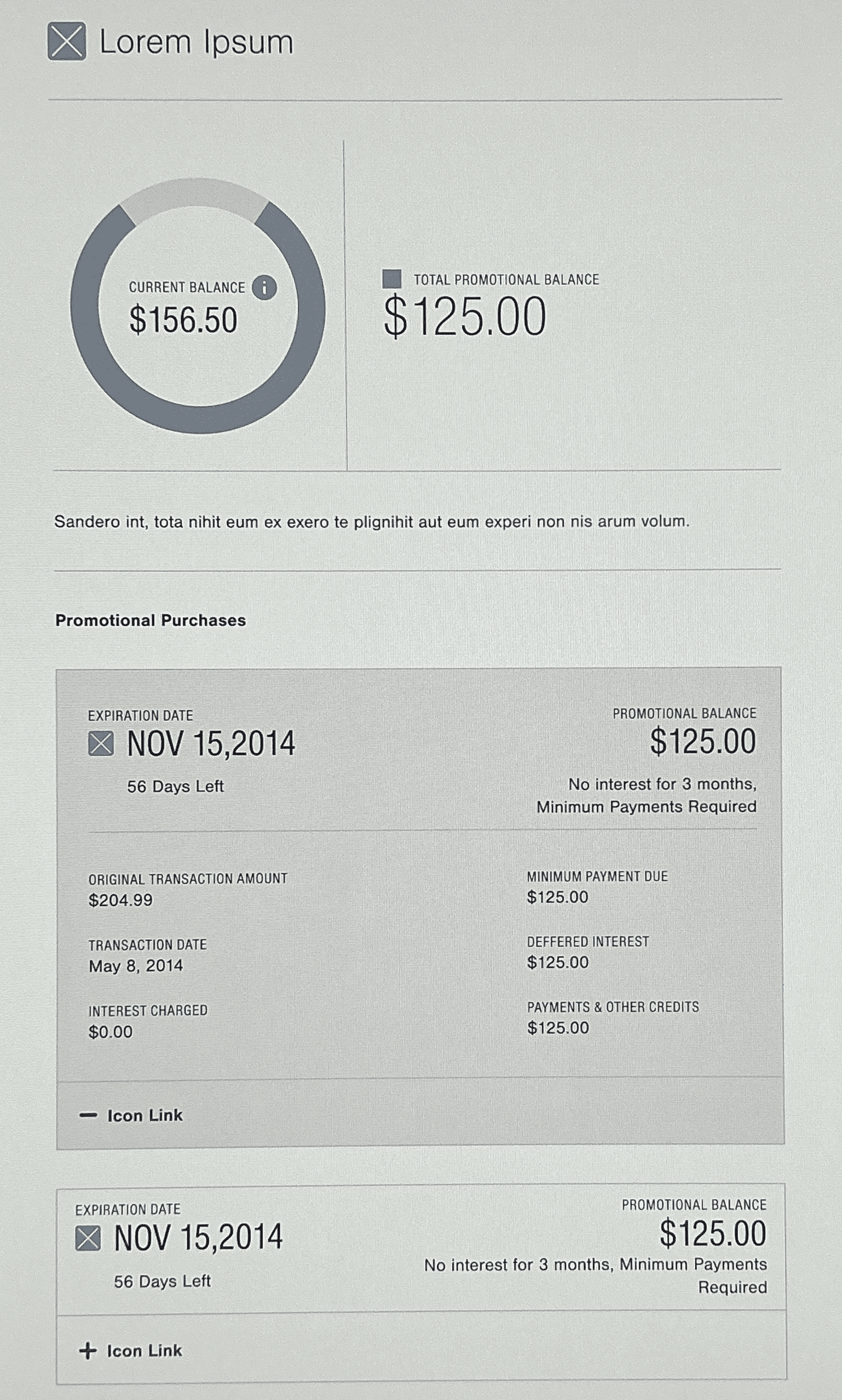
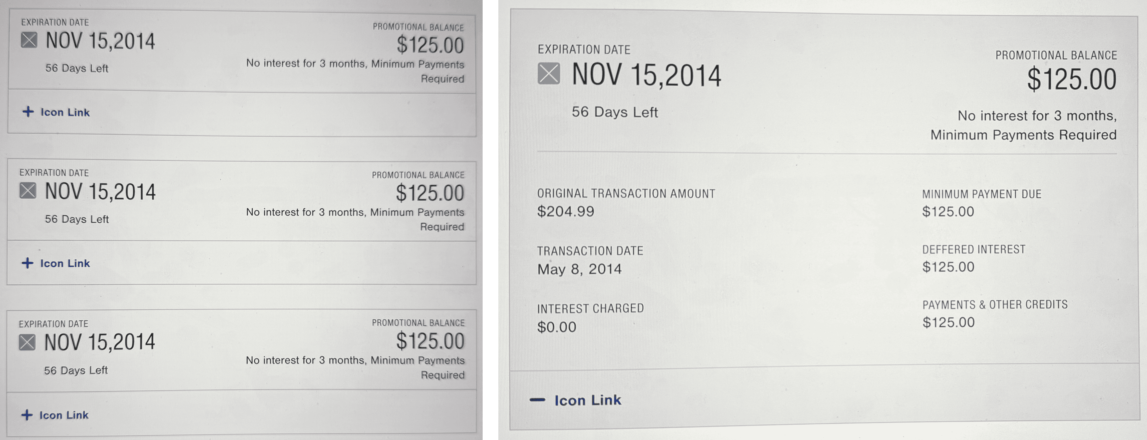
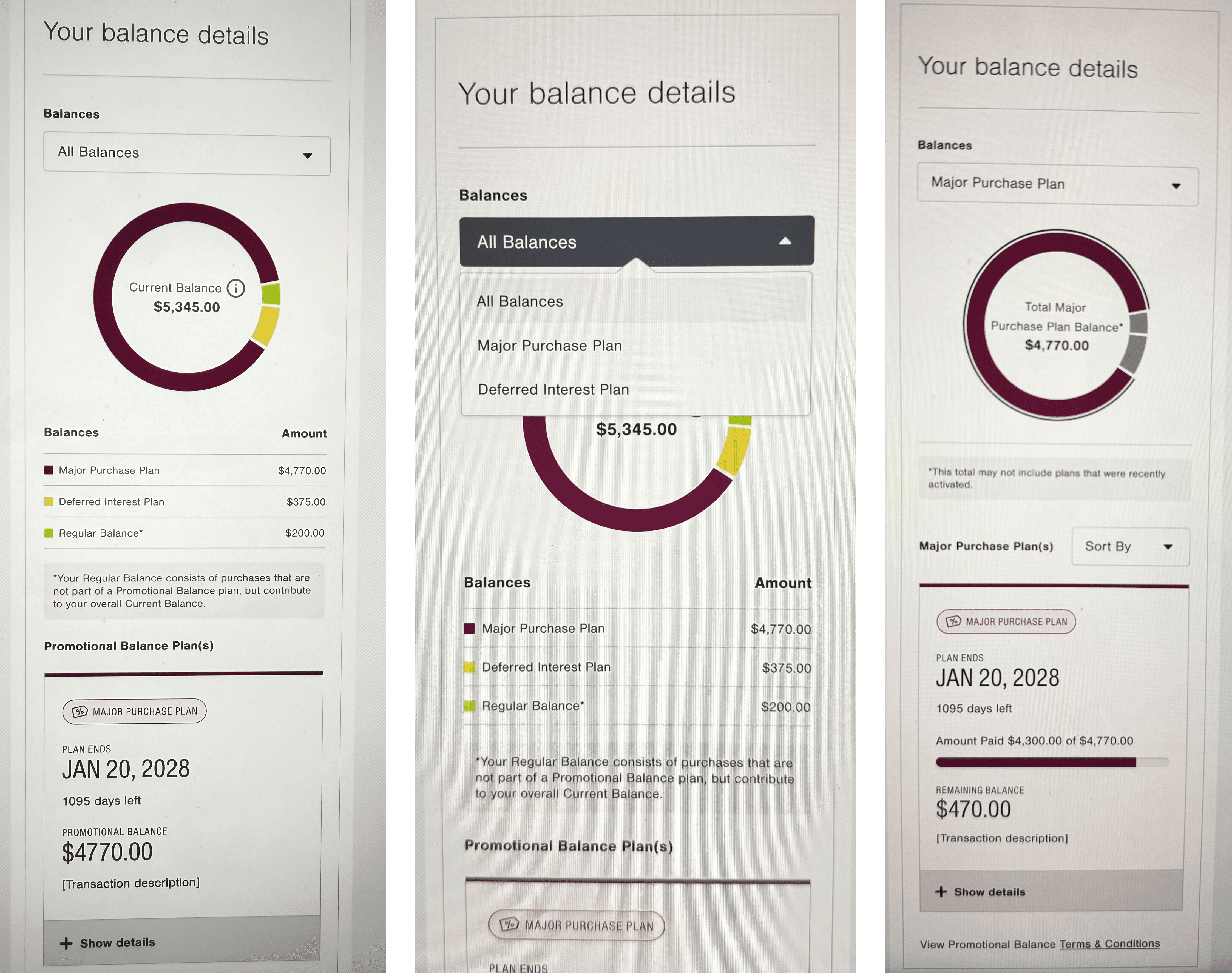
* This previous page was designed and built to support only one type of promotional balance. We now would need to cater to a minimum of FIVE different balances.
We mapped out the unique requirements for each of the 20+ partners: what varied, what couldn’t vary, what required legal review, and what could be configuration. That mapping exercise turned into the governance model for the design system going forward.
06 The Phased Rollout Strategy
Early in the project, engineering flagged capacity constraints that made a full launch unrealistic in the initial timeframe. Rather than treating this as a blocker, I worked with Product and Engineering to design a phased approach that delivered real user value at each stage while managing technical debt responsibly.
Phase 1a
Proactive Enrollment
User opts in to split eligible purchases upfront
Phase 1b
Reactive Enrollment
User splits a past purchase after the fact
Phases 2–3
Scale & Expand
More balance types, partners, and payment options
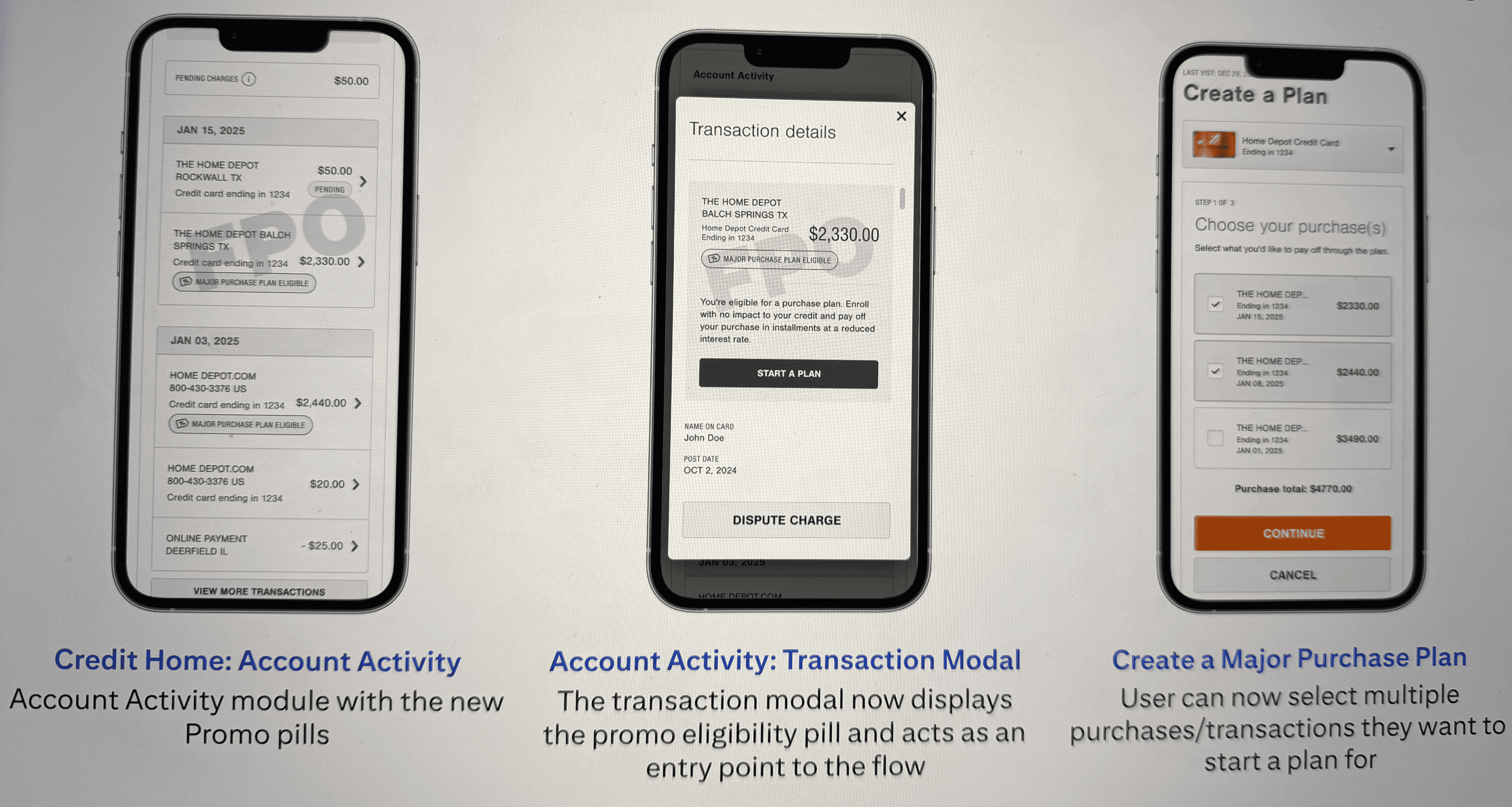
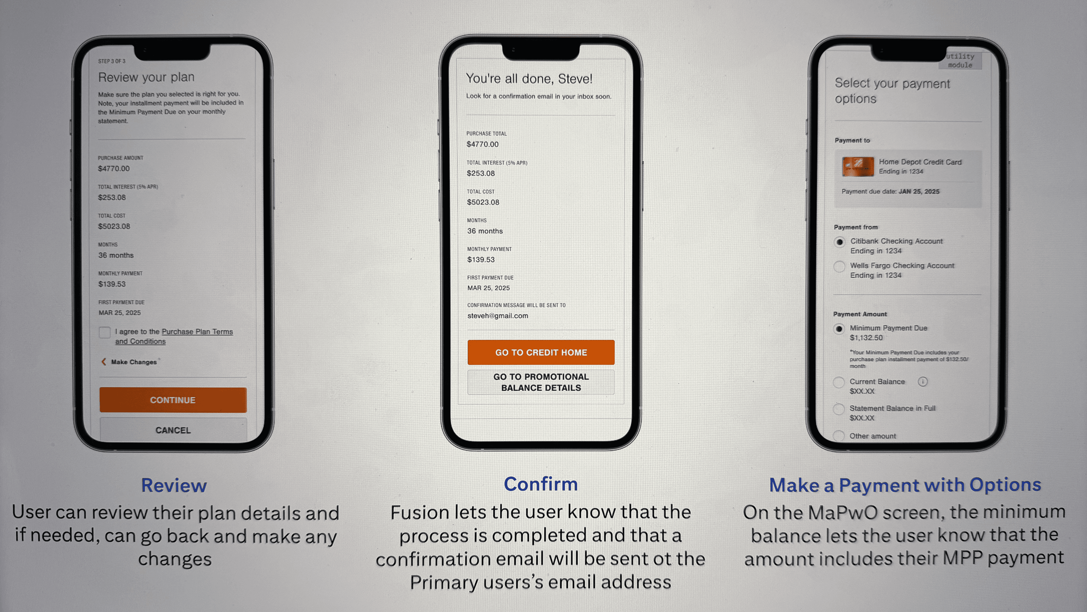
The distinction between Phase 1a and 1b was more than a sequencing decision it reflected two fundamentally different user contexts. A proactive enrollment (1a) happens at the moment of purchase, when the user is already engaged and making a financial decision. A reactive enrollment (1b) happens later, when the user is reviewing their account and may be looking for ways to manage an existing balance. The design work for each was quite different, even though the underlying feature was the same.
The phased strategy also gave us a mechanism to unlock additional budget through a separately funded initiative, which was a pragmatic outcome of a constraint that initially felt like a problem. Framing the phased rollout as a risk-managed expansion rather than a scaled-back version of the vision was an important stakeholder communication choice.
Phase 1b
The Reactive Enrollment Flow
07 The Design Process
Starting with no constraints
At the beginning of the design phase, I gave the team a week of unconstrained exploration what I call Pie in the Sky thinking. No engineering feasibility, no legal review, no partner requirements. Just: what’s the best possible version of this experience? The outputs from that week weren’t shipped, but they set a quality bar and a directional vision that influenced every subsequent decision. When we had to make trade-offs and we made many, we had a reference point for what we were trading away.
Grounding in reality
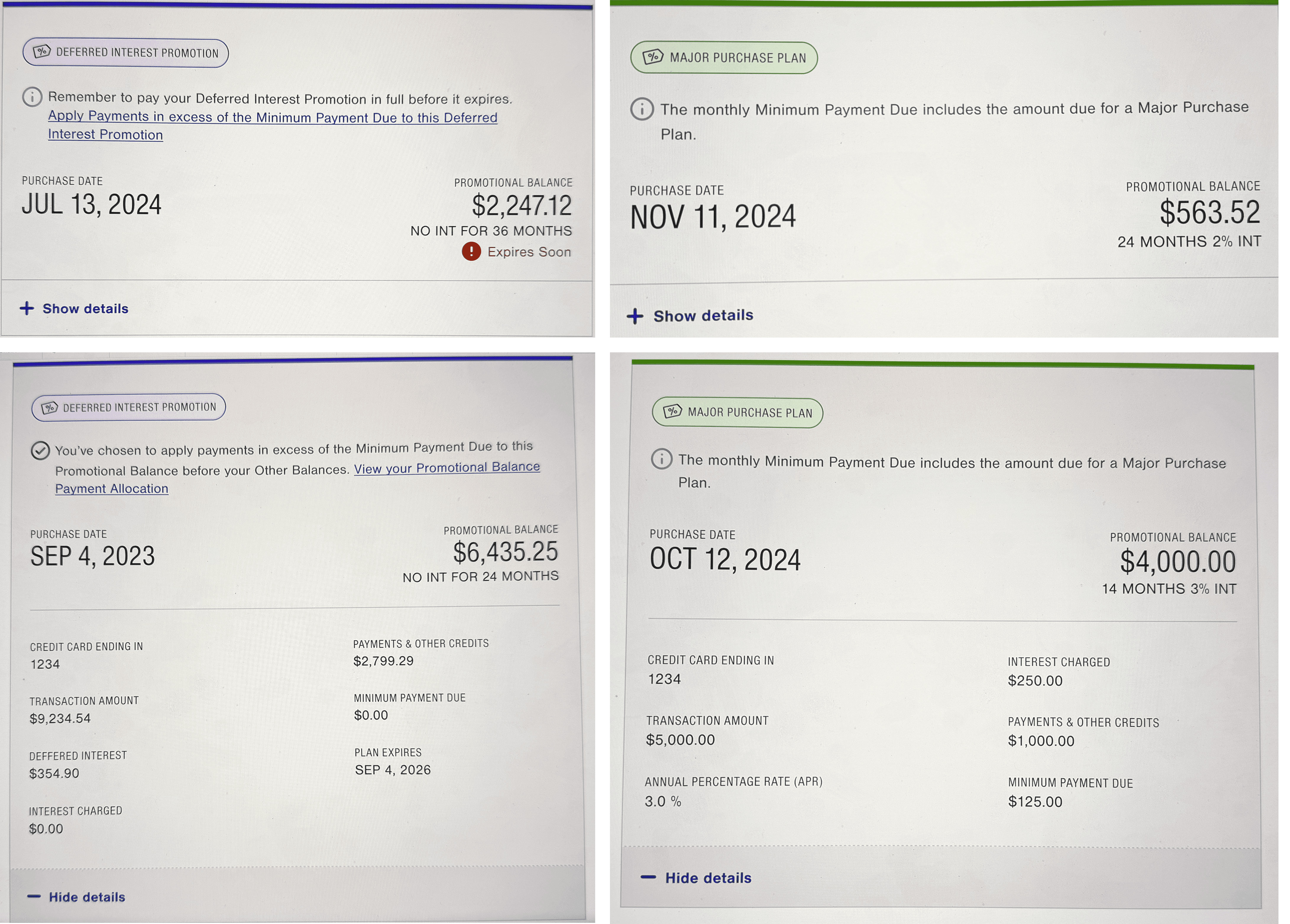
The second phase was a series of working sessions with Product and Engineering to understand what was actually feasible, on what timeline, with what dependencies. Competitive analysis against Chase Pay Over Time, Amex Split It, and Citi’s own international equivalents gave us benchmarks and revealed patterns we could learn from without simply copying. The 20-partner mapping exercise happened here too it was unglamorous work, but it was essential to understanding the full design surface.
Navigating legal and compliance
Payment features in financial services have disclosure requirements that aren’t optional. Interest rates, fee structures, promotional term lengths all of these need to be presented in specific ways, with specific language, in specific contexts. I brought Legal in at two key milestones rather than waiting for handoff, which was a deliberate choice based on a previous project where late legal review had required significant rework. The compliance constraints were genuinely design constraints they affected where information could live, how it could be prioritized, what could be hidden behind progressive disclosure and what couldn’t. Working with Legal early meant we could design around those constraints rather than retrofitting for them.
Legal requirements in financial services aren’t the enemy of good design. But they do change the game. Bringing Legal in early isn’t just a process improvement, it’s a design decision.
08 Outcomes
20+
Partner brands supported by white-label architecture
2
Designers + 1 copywriter + 1 content strategist led
3
Phased rollout delivered discovery through handoff
100%
Executive alignment achieved across Product, Legal, Engineering & Business
Post-launch performance data wasn’t available at the point this case study was written the feature was in final development. What I can speak to are the delivery outcomes. All screens were completed and handed off to engineering with reusable, documented components. Executive leadership provided positive validation of the balance between user experience and business feasibility. The design system architecture was approved as the foundation for future payment option expansions.
The cross-functional alignment piece is the outcome I’m actually most proud of. Getting Product, Engineering, Business, and Legal into a shared direction on a feature this complex with 20+ partner variations, phased technical delivery, and payment disclosure requirements is not a given. It requires sustained effort, clear communication, and the willingness to revisit decisions when new information surfaces. We did all of that, and the product is better for it.
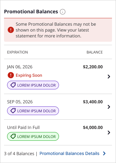
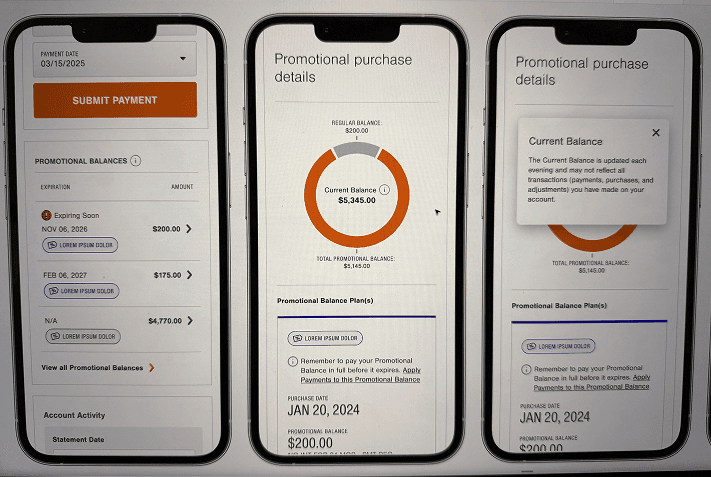
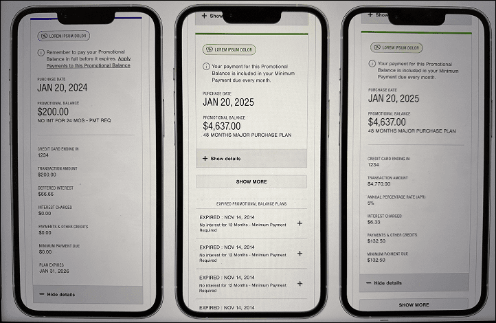
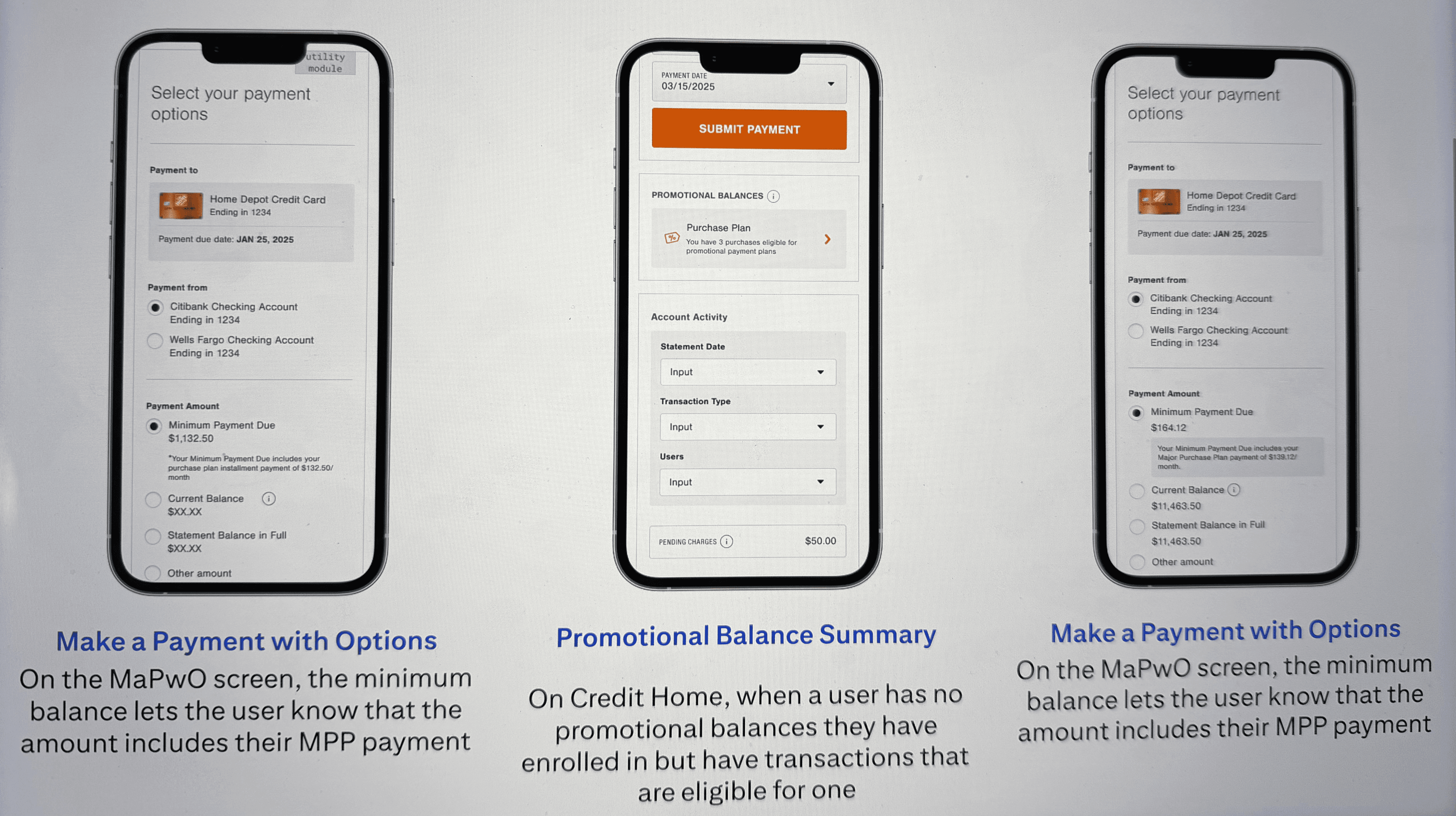
* The new summary view of the Promotional Balances gives user more context on their active plans
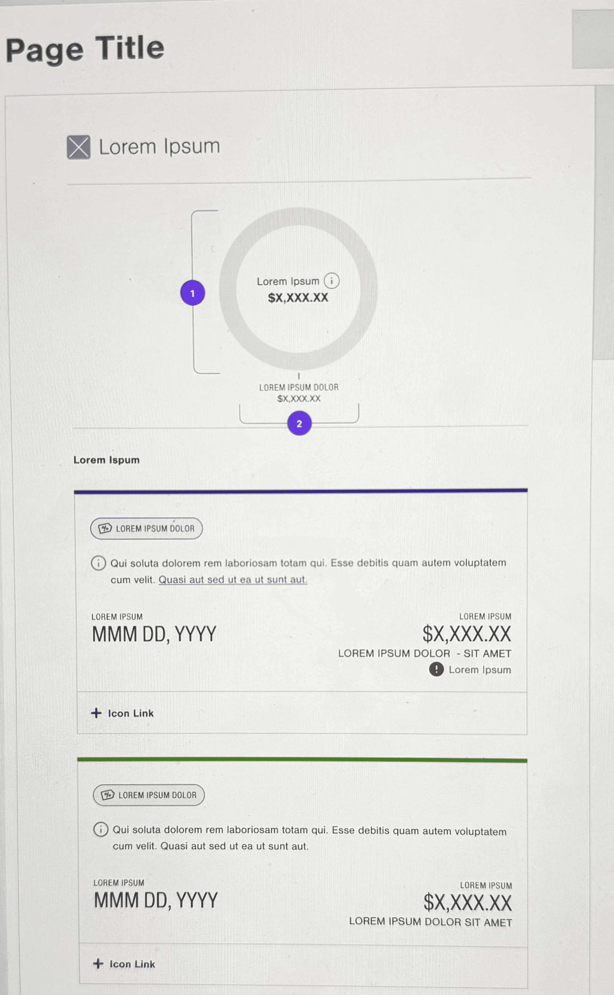
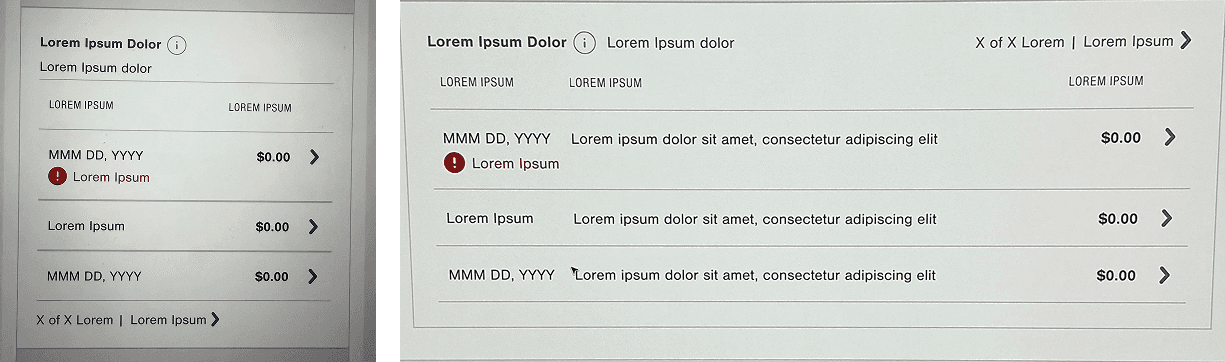
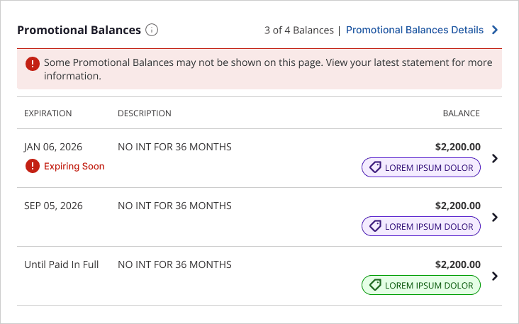
* The in-between phase now can house multiple Promotional Balances whilst giving user more context and information on their existing plans
09 Reflections
Scope expansion is an opportunity if you hold the user anchor
When the brief expanded from a single-partner feature to a white-label platform, it would have been easy to lose focus on the person actually using the product. The compliance requirements, the partner variations, the technical constraints all of these have a gravitational pull toward designing for the system rather than the user. I tried to hold the user research insights as the constant anchor through all of those changes. Whether it worked is something the post-launch data will tell us, but the intention shaped every trade-off discussion we had.
Bring Legal in earlier than feels necessary
The biggest process lesson from this project. In financial services, legal and compliance aren’t a final gate they’re design inputs. Treating them that way means discovering constraints early enough to design around them, rather than redesigning to accommodate them. If I could change one thing about how the project ran, it would be involving Legal from week one rather than at milestone reviews.
White-label design is systems thinking at its most demanding
Designing a system that works for 20+ brands simultaneously, without becoming so generic that it works for none of them, is one of the harder design challenges I’ve taken on. The separation of structural layer from surface layer is the principle that made it tractable. The structural layer the flows, the hierarchy, the disclosures is where the user experience lives. The surface layer is where the brand lives. Keeping those two things clearly separate, and resisting the pressure to let one bleed into the other, is what made the architecture hold.