Super Krishak
Designing for Farmers at the Edge of Connectivity
Building an offline-first agritech app for smallholder farmers in rural Nepal — from zero to 30,000+ users, 18% daily retention lift, and a product that became a case for national grant funding.
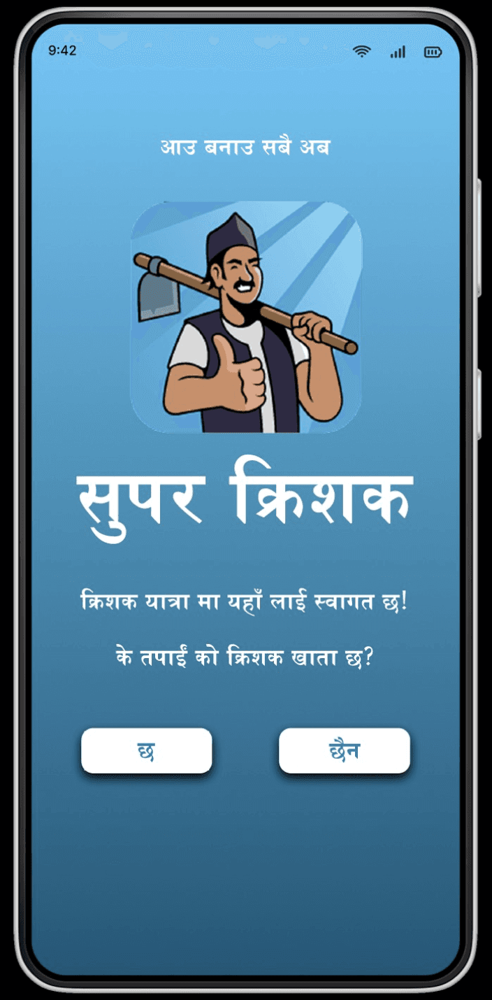
Super Krishak - latest iteration of the app launch screen, designed for low-literacy users in rural Nepal
R O L E
Lead Design
C L I E N T
Super Krishak / Gham Power
P L A T F O R M
Mobile App (iOS & Android)
S C O P E
Jul 2020 - Oct 2022
Impact at a Glance
30K+
Mobile app users
70K+
Facebook community members
+18%
Daily retention over 4 weeks
-40%
Onboarding time reduction
01 The Context
Super Krishak wasn’t a typical product brief. It grew out of a solar energy company’s field work in rural Nepal, he team at Gham Power kept running into the same problem on installation visits: farmers had land, they had desire, but they didn’t have access to the knowledge or tools that could make their work meaningfully more productive. The app was the response to that gap.
The user base was unlike anything I’d designed for before. We were designing for older, low-literacy farmers in geographically remote areas with unreliable internet connections, low-end Android devices, and limited prior experience with mobile apps beyond basic calls and Facebook. At the same time, there was a growing secondary segment — younger Nepalis who had worked abroad and returned, who had higher digital expectations and were looking for a reason to stay and build something at home.
Those two user groups had different needs, different mental models, and different relationships with technology. Designing for both of them simultaneously, on a startup budget, with a small team, in Nepali that was the real challenge.
The hardest design problems aren’t usually about interface complexity. They’re about the gap between who you’re designing for and what your team assumes about them.
02 My Role
I joined as the Lead Designer with end-to-end ownership of the product experience. There was no product manager, which meant that in practice I was doing a significant amount of product thinking alongside the design work partnering directly with the CEO on roadmap decisions, facilitating prioritization sessions with engineering, and helping the team think through what to build, in what order, and why.
I also mentored two junior designers and introduced the team’s first structured design system something that started as a practical necessity and became genuinely foundational as the product grew more complex.
Across the project, I owned:
End-to-end UX design: flows, wireframes, high-fidelity mockups, prototypes, and specifications
Design system creation and governance built in Figma, documented in Notion
Mentoring two junior designers and establishing internal design quality standards
Co-developing the phased product roadmap with the CEO in the absence of a dedicated product manager
Facilitating design-engineering alignment through weekly syncs and rapid prototyping sprints
User research: field visits, moderated and unmoderated testing, WhatsApp interviews with early adopters
Defining product measurement KPIs with engineering and analytics teams using Mixpanel and Firebase
03 The Core Challenges
Designing for Users Who Didn’t Look Like Us
The most important thing I did on this project happened before I opened Figma. I pushed hard for field visits early not surveys, not analytics, but actually going to rural areas and watching farmers interact with devices. What we found shaped everything that followed.
Older farmers needed large icons, bold text, and features that were never hidden in nested menus or collapsed accordions. Scrolling behaviors were unreliable. Video content drove significantly higher knowledge retention than text-based modules. And the app had to work offline, because consistent internet access wasn’t a given in many of the villages we were designing for.
None of this was surprising in retrospect, but it required active advocacy to get the team to internalize it. Part of my job was making sure that default assumptions about users didn’t quietly shape decisions they had no business shaping.
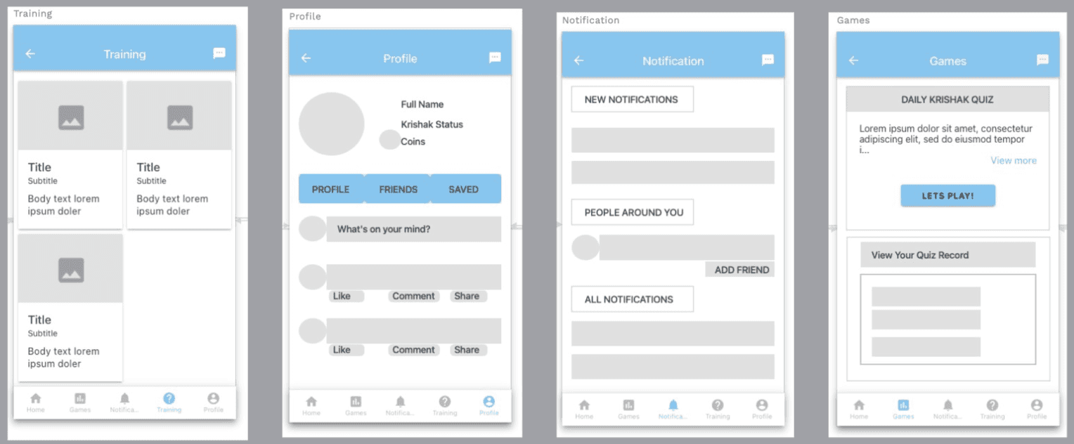
Early wireframe concepts : Training, Profile, Notifications, and Daily Quiz screens. The Daily Krishak Quiz feature (far right) was a key advocacy win in the MVP scope debate.
Pushing Back on "Just Launch Something"
Early in the project, leadership wanted to move fast and ship a minimal feature set, essentially a stripped-down information app with no interactive elements. I understood the instinct, but I thought it was the wrong call for this particular user base.
My concern was that older, less tech-savvy users needed a reason to come back. A static information app wouldn’t build the habit loop that retention required. I advocated for what I called a Minimum Lovable Product rather than a Minimum Viable Product, the difference being that an MLP includes enough engaging features to give users a reason to return, even if the overall scope is still limited.
The feature I pushed hardest for was daily quizzes. The hypothesis was that a short, rewarding daily interaction would build digital confidence in users new to apps, create a habit, and generate the engagement data we’d need to justify future investment. The results validated that thinking: quiz participation increased average session time by 3 minutes and raised daily retention by 18% over the first four weeks.
An MVP gets you launched. An MLP gives users a reason to come back. For a user base that was new to mobile apps entirely, that distinction mattered enormously.
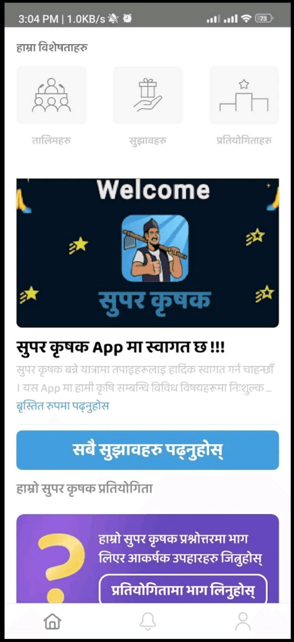
Home screen showing the daily quiz and competition features the engagement drivers I advocated for in the MVP scope, which produced the 18% retention lift
Resisting the Facebook Clone
One of the more challenging conversations I had with leadership was around product direction. The app had originated from a Facebook group with 70,000+ members, and there was a strong pull to simply replicate Facebook’s feature set within the app. The logic made sense on the surface users were familiar with it, so why not give them more of what they knew?
The problem was that Facebook’s design is built for a fundamentally different context and user base. Replicating it would have meant importing a lot of complexity and cognitive overhead that our users didn’t need and couldn’t easily navigate. I used the research insights from our field visits to make the case: familiar interaction patterns were valuable, yes, but the irrelevant social scaffolding wasn’t.
What our users needed was a focused, purposeful experience that grew with their digital confidence, not a general-purpose social network with agricultural content bolted on.
04 Key Design Decisions
Onboarding: speed over completeness
We had a problem common in apps targeting new digital users: we needed registration data for personalization, but a long onboarding flow would cause drop-offs before users ever got to the product. I pushed for OTP login and social sign-in as the primary entry points, with optional profile completion happening progressively over time rather than upfront.
The result was a 40% reduction in onboarding time. Users got into the app faster, and we captured data gradually, at moments where it was contextually relevant rather than as a gatekeeping step before value was delivered.
The design system as a team enabler
Early on, design inconsistency was slowing down engineering. I introduced a lightweight design system in Figma not comprehensive, but enough to establish the foundational components and remove ambiguity from the most common patterns. The system grew as the product did, and by the time we were building marketplace and diagnostics features in later phases, the component library had saved significant time in both design and QA. It also gave the junior designers a clear framework to work within, which raised consistency without requiring constant review from me.
Iteration rhythm: launch, measure, refine
We didn’t have the budget for elaborate research cycles between releases. Instead, I worked with the analytics team to establish a lightweight measurement loop using Mixpanel and Firebase tracking onboarding completion, daily active users, feature-specific engagement, and early monetization signals. One insight that came out of this loop: localized video content consistently outperformed text-based modules in knowledge retention. That shifted how we approached content design in subsequent phases more video, less long-form text, more visual instruction patterns throughout.
05 Outcomes
30K+
Mobile app users
70K+
Facebook community members
+18%
Daily retention over 4 weeks
-40%
Onboarding time reduction
The numbers tell part of the story. 30,000+ mobile app users and 70,000+ community members represented real traction in a market that was genuinely difficult to reach. The 18% daily retention lift from the quiz feature validated the MLP argument. The 40% onboarding reduction showed that removing friction at the entry point had a real effect on adoption.
The app was shortlisted for national grants and came under review for private equity funding. Early revenue came in from two paid features: soil diagnostics and pest identification. And there was a downstream effect on on-site training demand — app engagement was driving farmers to want more in-person support, which was exactly the behavior Gham Power had hoped to cultivate.
06 Reflections
Designing with, not for
The field visits were the most valuable thing we did on this project, and they were also the hardest to justify to a team under pressure to ship. Going to rural areas to watch farmers use phones doesn’t fit neatly into a sprint and doesn’t produce a deliverable you can point to in a review. But it fundamentally changed how we designed, in ways that no amount of desk research could have replicated. I’ve carried that lesson into every project since.
Stepping into the product vacuum
Working without a product manager forced me to develop a part of my thinking that pure design work doesn’t always exercise: how do you sequence a roadmap, how do you weigh competing priorities, how do you make a case for what to build next when there are ten reasonable options? Those are product questions, and having to answer them made me a better designer and a more credible collaborator with product and engineering leaders in later roles.
Constraints and scale
Designing for low-end Android devices, unreliable connectivity, and low-literacy users is an extreme version of a design constraint. But the principles it reinforced prioritize ruthlessly, reduce cognitive load, never assume technical fluency, design for every state apply at every scale. Some of the most useful instincts I brought to the Citi work came from spending two years designing for farmers in Nepal.