theGrodeli
Nepal’s First Digital Grocery Platform
Designing a mobile-first grocery ordering platform for Kathmandu consumers from WhatsApp-based MVP to a native app with 10,000+ installs, 63% onboarding conversion, and a 14-point drop in cart abandonment.
R O L E
Product Designer
C L I E N T
theGrodeli
P L A T F O R M
Android, iOS & WhatsApp
S C O P E
May 2018 -
Jul 2020
Impact at a Glance
5K+
Play Store installs
63%
Onboarding conversion (up from 45%)
18%
Cart abandonment (down from 32%)
25%
30-day retention industry benchmark hit
Note: This was my first design role. The metrics reflect work done as part of a small product team.
01 The Context
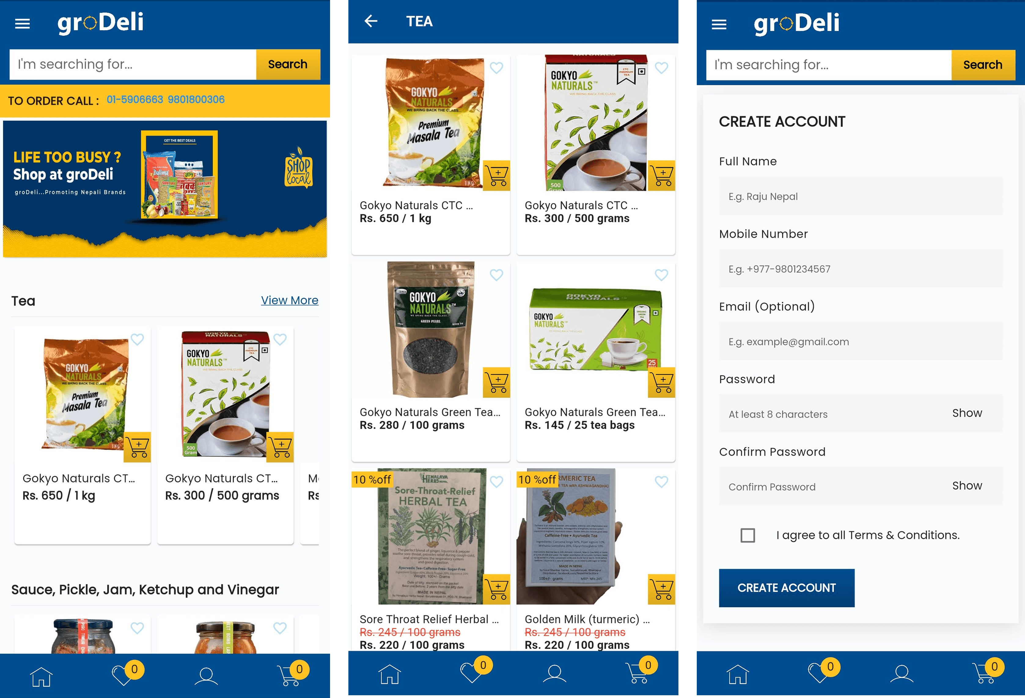
theGrodeli launched at an interesting moment. Kathmandu consumers particularly working age Gen X households and younger urban millennials were spending hours every week navigating crowded markets with unpredictable hours and no way to track their orders or compare prices. The problem wasn’t lack of demand for a better solution; it was that nothing digital existed yet for local grocery.
The business had started with a WhatsApp ordering group, which had found early traction but was fundamentally hard to scale. Free-form messages were difficult to parse, orders were easy to misinterpret, and there was no way to surface promotions or build customer loyalty. The native app was the step from proof-of-concept to real product.
I joined as a Product Designer working under a Lead Designer. It was my first formal design role, and I came in with a lot of enthusiasm and not a lot of hard experience. What I learned over those two years shaped how I approach design work to this day.
Nepal didn’t have a digital grocery platform yet. We weren’t iterating on an existing product category, we were introducing one. That changes how you think about onboarding, education, and trust.
02 Understanding the Users
One of the first things I was asked to do was help define the primary user personas. We had two very distinct segments with different behaviors, different devices, and different relationships with technology.
User personas

Name :
Maya
Age :
45 years
Profession :
Home manager
Bio:
Shops every 3-4 days; carries her phone with two hands.
Prefers large icons, clear labels, and minimal steps to complete a task.
Trusts cash on delivery; cautious about digital payments.
Her key need: get the weekly staples ordered quickly without confusion.
Goals:
Find big discounts and good offers.
Don't waste time and energy on shopping.
Find best value products.
Frustrations:
Cluttered information apps/websites.
Difficulty in browsing for products ( bad categories, lack of filtering).
Find best value products.

Name :
Rohan
Age :
24 years
Profession :
Student
Bio:
Shops impulsively via mobile; one-hand thumb navigation.
Responds to promotions and quick-pay options.
Comfortable with digital wallets and social login.
His key need: fast checkout, relevant offers, no friction.
Goals:
Simple and easy to use platform to create listing and buy your favorite pieces.
Get access to top brands.
Want to order anytime from anywhere.
Frustrations:
Not knowing what's on sale.
Products not as described.
Slow delivery time.
The challenge was that designing for Maya and Rohan simultaneously required genuinely different thinking. What reduced friction for Rohan : fast-access menus, gesture-based interactions, dense information created confusion for Maya. We resolved this through a front-loaded, large-target UI that worked well for Maya without feeling dated to Rohan, rather than trying to build two separate experiences.
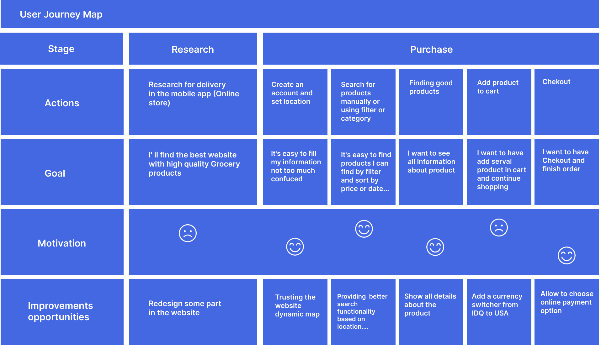
User Journey
We made a visual representation of the user's journey across all touchpoint of our application where we can improve the user experience.
03 Key Design Decisions
Onboarding: removing the front door
The first version of the onboarding flow asked users to complete a full registration form before they could do anything. Predictably, drop-offs were high - 45% conversion at a point where users hadn’t yet seen enough of the product to justify the effort.
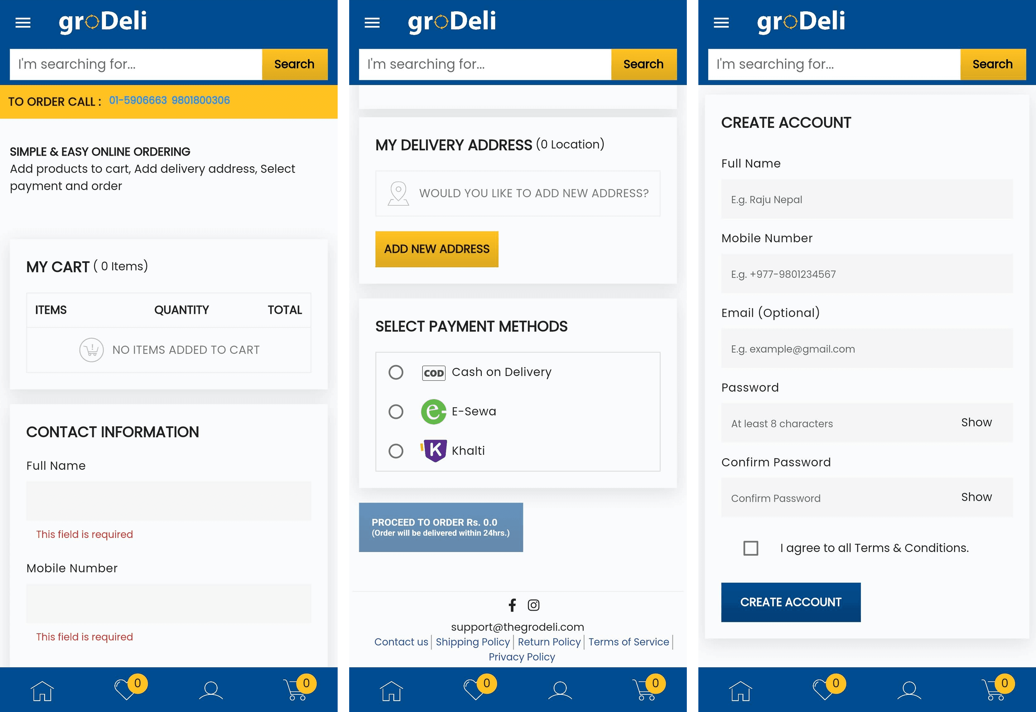
I worked with the Lead Designer to redesign the entry point around OTP login and Facebook sign-in, with profile completion deferred until after the user had already experienced value. The logic was simple: make the cost of entry as low as possible, then earn the right to ask for more. Onboarding conversion went from 45% to 63%, a meaningful jump that directly affected the size of the addressable user base from day one.
The WhatsApp Integration
This was probably the most interesting design challenge on the project, and also the one I’m most proud of. The WhatsApp group had real users and real traction, but free-form text ordering was impossible to scale. Orders were ambiguous, items got misread, and there was no way to surface the catalog in a structured way.
The solution we landed on was a structured WhatsApp experience with templated quick-reply buttons and a carousel of the top five SKUs. Rather than trying to replace the conversational feel that users liked, we introduced just enough structure to make orders parseable and actionable.
How the flow worked:
User taps "Order via WhatsApp" in the app opens a new chat with a pre-filled message
Quick-reply options: Place Order / View Catalog / Help
Carousel of top 5 SKUs with a one-tap add button
Bot summarizes the order; user confirms with a single tap
Backend API receives the structured order and triggers fulfillment
It wasn’t a perfect solution, there were edge cases and fallback flows that added complexity. But it met users where they already were, which in a market introducing digital grocery for the first time felt more important than a technically cleaner approach that would require more behavioral change.
Usability Testing & Findings
We ran usability testing with 13 participants: 8 Gen X and 5 Gen Z across a mix of moderated remote and field sessions. We measured time to add-to-cart, task completion, and SUS scores. Three issues surfaced that required immediate design responses.
The search issue was the most consequential. A 30% first-search failure rate would have undermined trust in the product for a user base that was already cautious about digital shopping. Spell-tolerant autocomplete was a straightforward fix technically, but it required me to articulate the business case clearly enough that engineering prioritized it above other items in the sprint. That was a useful early lesson in how design advocacy actually works.
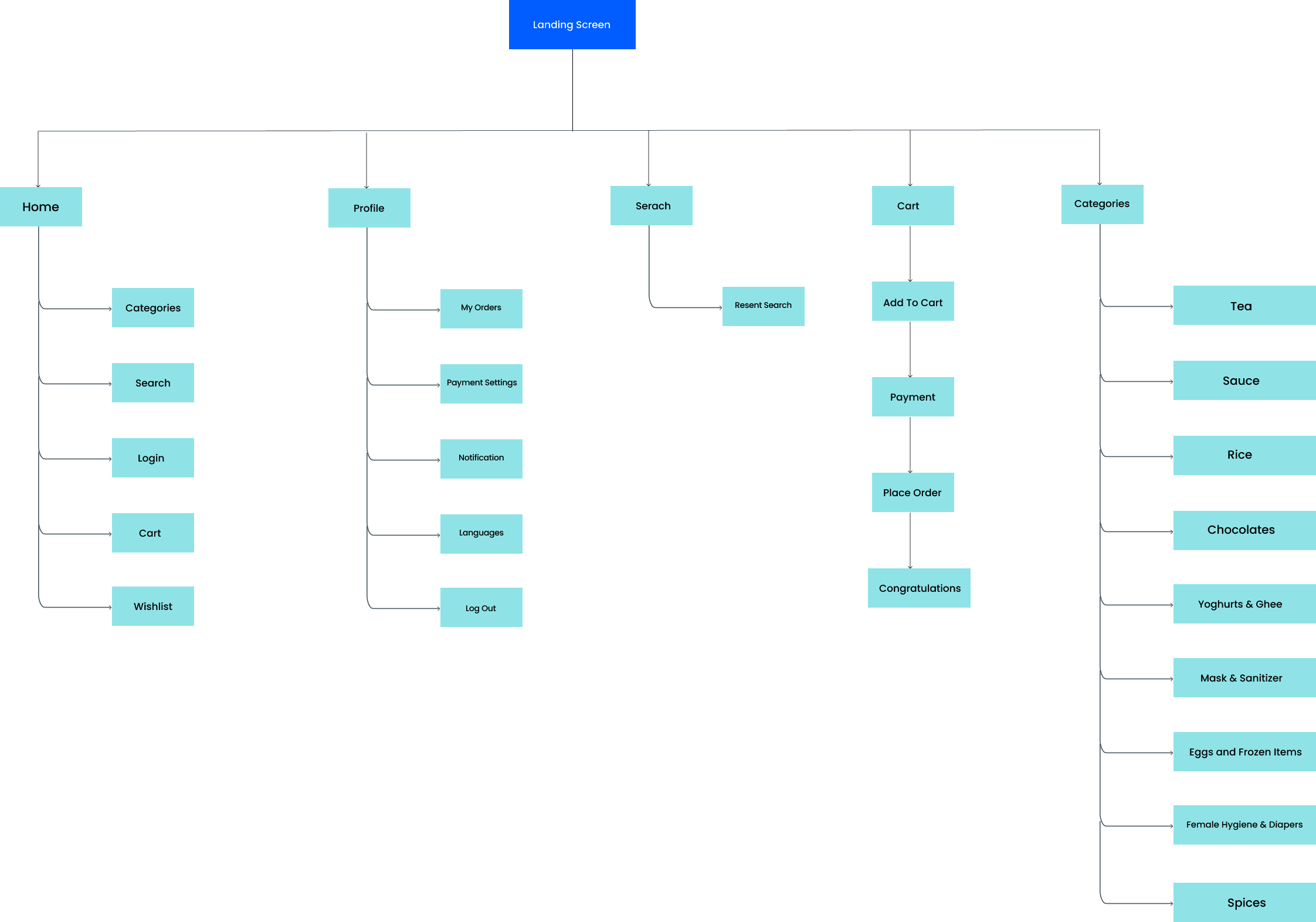
Information architecture aims at organizing content so that users would easily adjust to the functionality of the product and could find everyting they need without too much effort.
Visual Design System
Working with the Lead Designer, I helped build a lightweight Figma component library that covered the core patterns: primary buttons, the floating action button, product cards, and form fields. Everything was versioned and annotated with usage notes.
Core design tokens:
Primary:
#1E4B9C(deep blue) - header, primary CTAs, bottom nav, body text
Accent:
#F5A623(amber yellow) - search button, Add New Address CTA, cart badges, promo highlightsTypography: Sans-serif (Open Sans / Roboto) - Bold 18pt headings / Regular 14pt body
Primary button: 44px height, 4px radius - accessible tap target across all flows
04 Results
5K+
Play Store installs
63%
Onboarding conversion (up from 45%)
18%
Cart abandonment (down from 32%)
25%
30-day retention industry benchmark hit
The numbers were encouraging for a first product in a new category. Hitting 10,000+ installs validated that there was real demand. The onboarding and cart abandonment improvements showed that the design changes were making a measurable difference to conversion. And reaching the 25% 30-day retention benchmark which was the industry standard we’d been targeting meant users were coming back, not just trying the app once.
The A/B test on one-hand mode for Gen Z users was a small but instructive data point: repositioning controls to the lower half of the screen pushed order completion from 70% to 78% for that segment. It confirmed something that’s easy to state as a principle but harder to actually act on: thumb reach is a constraint, not an afterthought.
09 Reflections
Starting with constraints taught me more than starting with freedom
theGrodeli was a startup with a small team, a limited budget, and users who had never used a digital grocery product before. Every decision involved trade-offs I hadn’t encountered in theory. How much onboarding friction is too much? When do you defer profile completion? How do you introduce a new behavior without alienating the users who are already comfortable with the old one? Those questions don’t have clean answers, and learning to navigate them in a real product environment was more valuable than any formal training I could have done.
Research isn’t just about discovering problems - it’s about building the case for solving them
The usability testing results gave me something concrete to bring to engineering prioritization discussions. The 30% search failure rate got spell-tolerant autocomplete prioritized because it was a number, not an opinion. That experience planted a seed that grew into something I rely on consistently in more senior roles: data is the most durable form of design advocacy, especially in teams where design doesn’t automatically have a seat at the table.
Meeting users where they are
The WhatsApp integration was the project’s most counterintuitive design decision. The "right" answer from a product architecture standpoint was to move all ordering into the native app. But the users were already on WhatsApp, already comfortable there, already trusting it. Designing a structured experience within that context rather than asking users to change their behavior entirely was the right call for that market at that moment. It’s a principle I’ve thought about often since: the best experience isn’t always the most elegant one. Sometimes it’s the one that requires the least behavioral change.