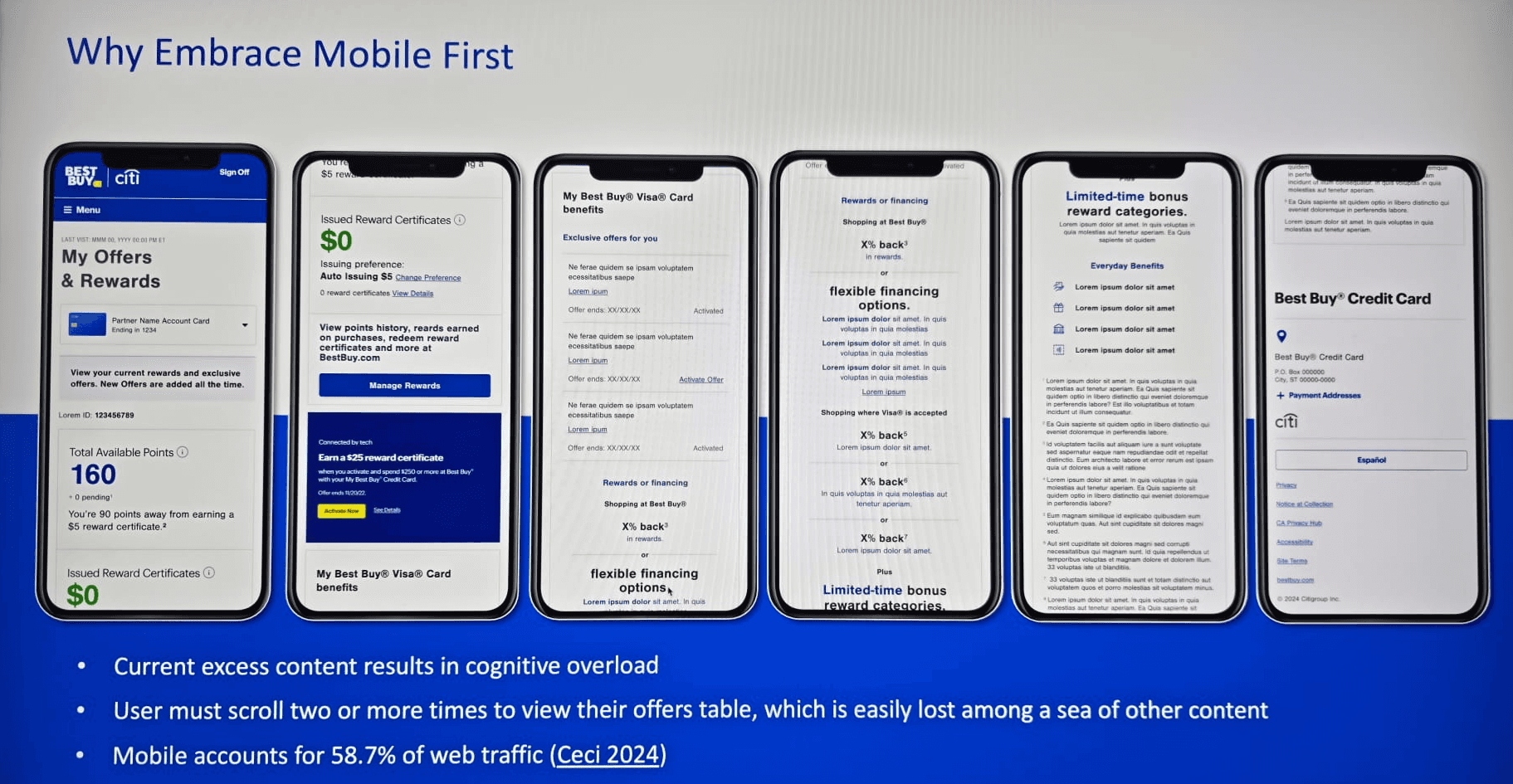
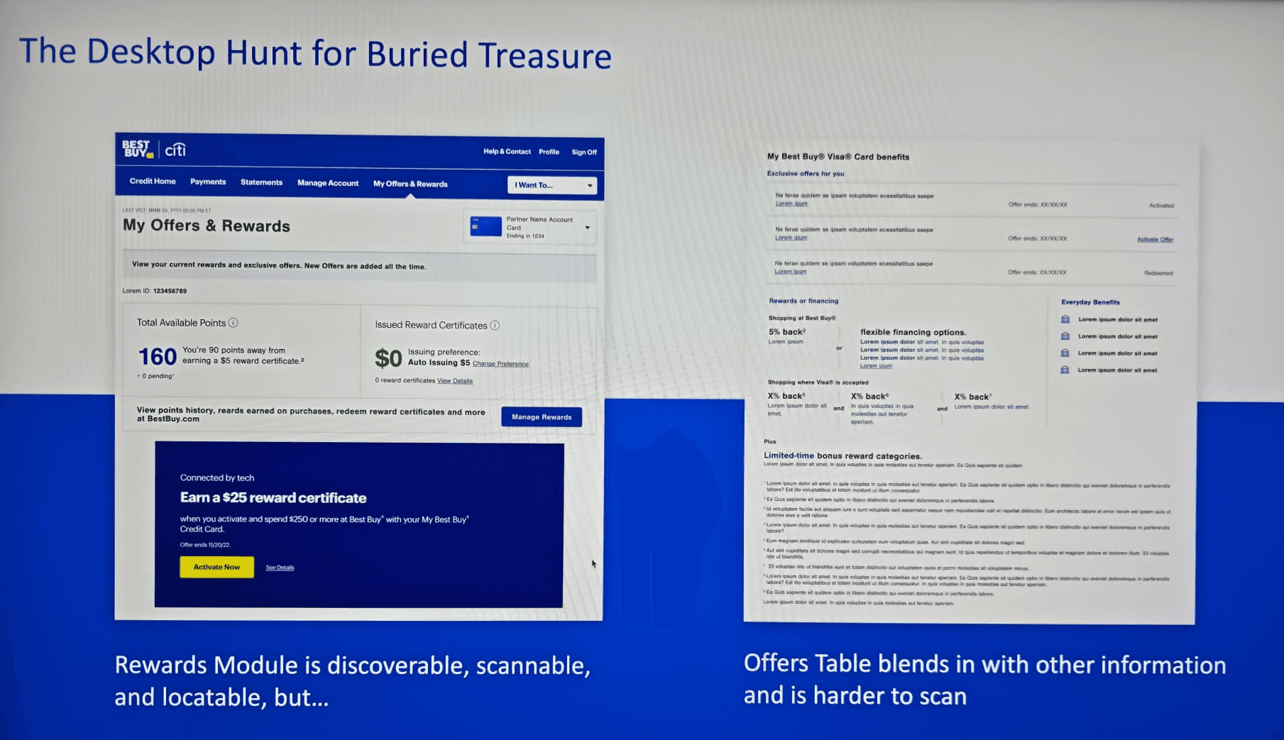
* Visuals shown are intentionally redacted or low-fidelity to honor NDA obligations with Citi Retail Services. Detailed walkthroughs available on request.
Redesigning the Best Buy credit card rewards experience for Citi, driving a 60% donut chart engagement rate and a 15% lift in offer interactions, delivered in under 3 months during a period of significant team restructuring.
R O L E
Design Lead
C L I E N T
Best Buy / Citi
P L A T F O R M
Web & Mobile
T I M E L I N E
Under 3 months
Impact at a Glance
60%
Donut chart engagement up from near zero
+15%
<3 mo
Full delivery: discovery through engineering handoff
* Metrics sourced from Best Buy analytics team post-launch. Exact figures withheld per NDA.
01 The Challenge
When I first got onto this project, what struck me most wasn’t the design brief it was the data sitting behind the existing page. Before any wireframe was drawn, the numbers told a story that was hard to ignore.
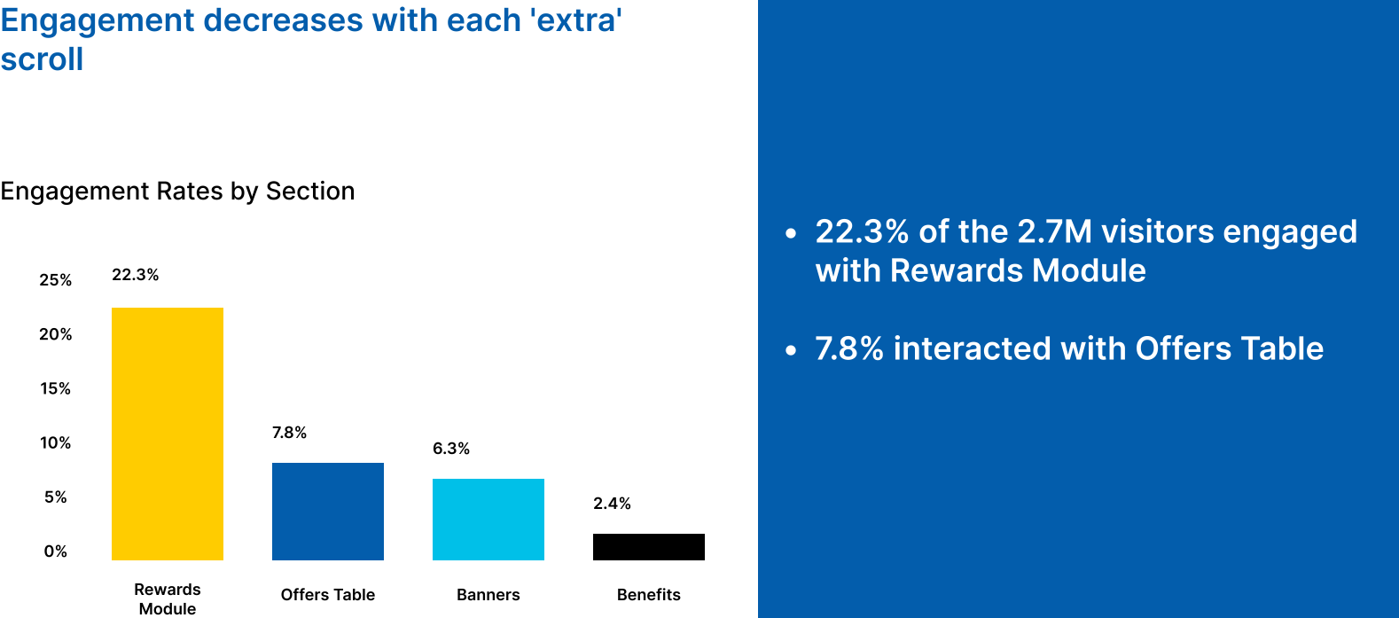
22.3%
of users engaged with the Rewards Points section
7.8%
engaged with the offers table - the primary revenue driver
2.4%
engaged with benefits - nearly invisible to users
A 7.8% engagement rate on the offers section the feature most directly tied to card usage and revenue wasn’t just a UX problem. It was a business problem that happened to have a design solution. The page was cluttered, the hierarchy made no intuitive sense to users, and the features that should have been front and center were buried under visual noise. The goal was clear: make the rewards experience feel worth engaging with, especially on mobile where most users were landing.
The data wasn’t just pointing to a design problem. It was pointing to a missed revenue opportunity sitting in plain sight.
02 My Role & Scope
I came into this project as the Design Lead, responsible for the team and the work. What I didn’t anticipate was that midway through, an internal restructuring would shift several of my team members onto other urgent projects. It wasn’t an easy situation to navigate these were people I’d been working closely with, and the timing wasn’t ideal. But rather than treating it as a reason to miss the deadline or descope the work, I made the call to absorb the execution myself while keeping up the cross-functional leadership the project required.
Looking back, that period is actually what I’m most proud of on this project. Not because doing everything yourself is a good model it isn’t but because it required me to be clear about what mattered most, move fast without cutting corners on the things that would affect users, and keep stakeholders confident in the delivery even when the internal situation was messy.
Across the project, I owned:
Team leadership, task allocation, and managing reassignments during the restructuring period
Stakeholder alignment across Product, Marketing, Engineering, Legal, and the BBY brand team
Analytics review and behavioral insight work there was no formal research budget, so this became my primary evidence base
End-to-end user journey mapping for the rewards redemption flow
All wireframes, UI explorations, high-fidelity mockups, and interactive prototypes
Usability testing and iteration
Design advocacy through several rounds of competing stakeholder opinions
Engineering handoff documentation and support through implementation
03 The Process
Getting Everyone Pointed in the Same Direction
The project didn’t have clearly defined requirements when it kicked off. In retrospect, that’s not unusual for a redesign of this complexity there were too many teams with too many different ideas about what the page should do. But it meant that before I could design anything useful, I needed to create alignment where there wasn’t any.
I led a series of cross-functional working sessions with Product, Marketing, Engineering, Legal, and Best Buy’s brand team. These weren’t just status meetings they were conversations about what each team actually needed versus what they thought they wanted, and finding the version of the solution that didn’t force anyone to compromise on what really mattered to them.
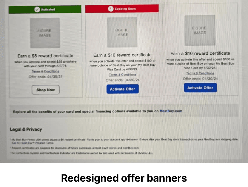
There were real tensions. Best Buy was firm that every offer had to be visible on a single page no horizontal scrolling, no pagination, no content hidden behind tabs. Legal had requirements around how rewards terms could be displayed. Marketing needed native banner placements that wouldn’t overwhelm the rest of the content. Getting all of these requirements to coexist without breaking the user experience took patience and a fair amount of back-and-forth, but it was the most important work I did on this project.
Working with What We Had
There was no budget for formal user research, which is a constraint I’ve run into enough times to have learned how to work around it. Instead, I leaned heavily on behavioral analytics from the existing page and combined that with stakeholder interviews and my own heuristic analysis of where the experience was breaking down.
The analytics were genuinely revealing. The rewards points module was the most engaged feature at 22.3%, which told me users understood the core value proposition they knew points existed and roughly what they were for. The problem was the path from understanding to action was too unclear. The offers section at 7.8% was the clearest signal that something was fundamentally wrong with how that content was being presented. And the benefits section at 2.4% was essentially invisible not because the content wasn’t valuable, but because nothing about the page’s hierarchy directed attention toward it.
Those numbers gave me something concrete to stand behind in every design review that followed. When stakeholders pushed back on decisions, I could point to the data rather than just my own design instincts.
The Design Decisions That Mattered
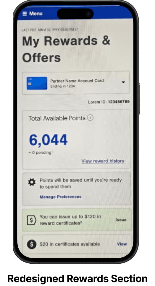
Leading with mobile
The majority of users were coming in on mobile, so I designed mobile-first and worked upward from there. This forced a level of content prioritization that actually made the desktop experience better too when you’ve had to make hard decisions about what goes above the fold on a small screen, you’ve already done the hardest thinking.
The donut chart
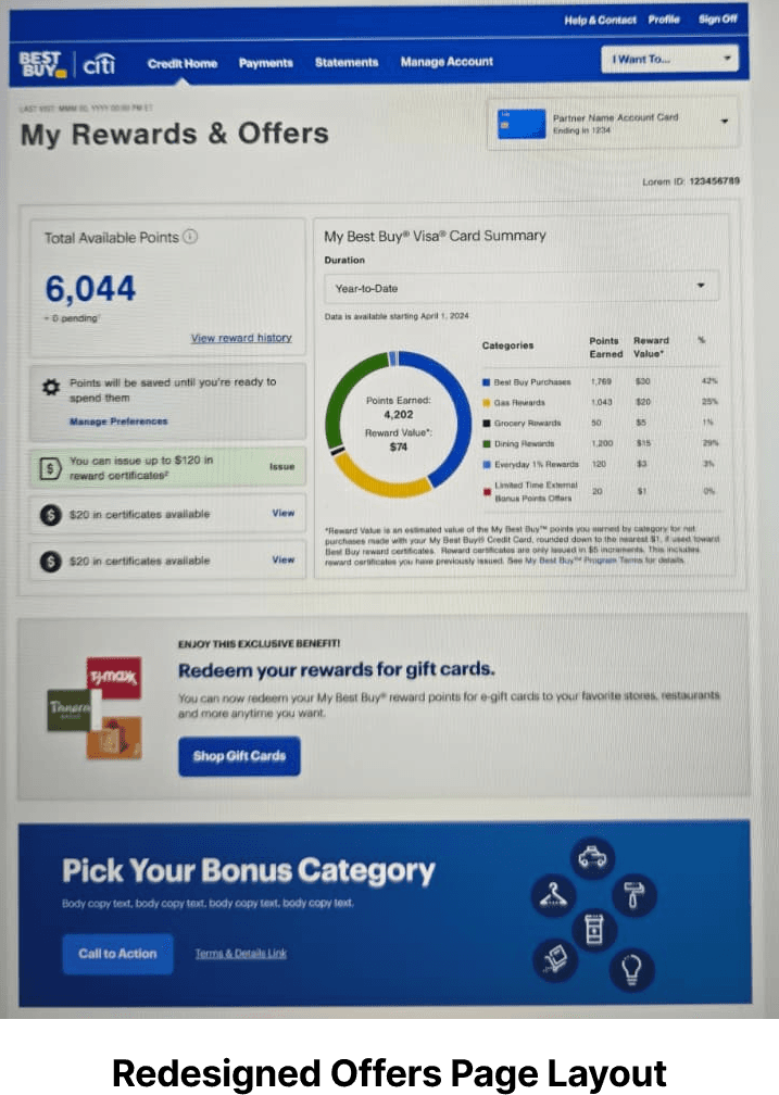
Introducing the donut chart was probably the most significant design decision on this project. There was no prior version of this feature I was proposing something entirely new to an experience that users already had expectations about. The idea was to give users a visual, at-a-glance way to understand how their spending across six categories was translating into reward points. A chart communicates that relationship instantly in a way that a data table simply doesn’t.
I positioned it immediately below the rewards-to-certificate conversion feature, which I’d established as the highest priority element on the page. The reasoning was that once a user understands they have points to redeem, the next natural question is how they earned them and the donut answers that question without requiring any additional navigation. The 60% post-launch engagement rate suggested that instinct was right.
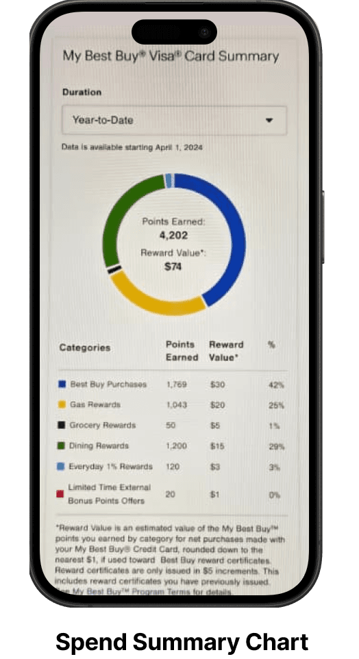
Donut chart close-up six reward categories with points earned, reward value, and percentage breakdown
Resolving the content visibility challenge
Best Buy’s insistence that all offers remain visible on a single page created a genuine design tension. My first instinct was to push back hiding content behind tabs or a carousel would have been cleaner. But after sitting with the requirement for a while, I started to see their point. For users who are browsing offers, the friction of navigating between sections actually reduces the chance they’ll find something relevant. The requirement wasn’t arbitrary.
What I proposed instead was a single-page continuous layout all offers presented in a vertically stacked, sequentially scannable format. No pagination, no hidden drawers, no horizontal scrolling. Each offer card had proper breathing room, the page structure stayed predictable, and users never had to wonder whether they’d seen everything. It wasn’t the pattern I would have chosen in a vacuum, but given the constraints, it ended up being genuinely the right call.
Visual hierarchy as a strategic decision
Once the structure was resolved, establishing the right content hierarchy was essentially a translation exercise taking what we knew about user behavior and business priority and expressing it visually. The sequence I landed on was: rewards-to-certificate conversion first, the donut chart second, major and seasonal offers third, and native banners last. That order reflects both what users most needed to be able to do and what the business most needed them to engage with. Keeping those two things aligned is, I think, one of the most underrated parts of UX work at this level.
Designing for the zero state
During prototyping, we hit a question that sounds simple but actually had some meaningful implications: what should the donut chart show for a user who hasn’t earned any points yet? The two options were to suppress the component entirely for zero-point users, or to show a ‘no points earned yet’ empty state.
We went with the empty state, and the decision came down to a few things. Conditionally suppressing a component adds page load complexity that isn’t worth it for a state that resolves after a user’s first qualifying purchase. More importantly, removing the donut for zero-point users would create an inconsistent experience someone who earns their first points would suddenly see a feature appear that wasn’t there before, which feels broken rather than rewarding. And an empty state with the right messaging something like ‘Make your first purchase to start earning rewards’ turns a null state into a prompt to act, which directly serves what the page is trying to do. It’s a small thing, but it’s the kind of detail that reflects how I think about design: every state a user might encounter deserves a considered response.
04 Results
60%
Donut chart engagement up from near zero
+15%
<3 mo
Full delivery: discovery through engineering handoff
The 60% engagement rate on the donut chart is the number I’m most proud of, because it was a net new feature with no prior user familiarity. Getting users to engage with something they’ve never seen before, at that rate, in a financial services context where users tend to be cautious about unfamiliar UI patterns, felt like real validation. The 15% lift in offer engagement mattered for different reasons that’s the number that translates most directly into card usage and revenue. And the steady rewards module engagement at 22% told us we hadn’t disrupted the one thing users were already relying on, which was a quiet but important success criterion.
What I remember most about the launch wasn’t the metrics it was the lack of complaints. In a complex multi-stakeholder project, shipping something that nobody wants to walk back is sometimes the most honest measure of success.
05 Reflections
Leading through ambiguity and resource loss
The restructuring mid-project was genuinely difficult. Losing team members to other priorities isn’t something you can fully plan for, and there’s always a version of that situation where it becomes an excuse for a compromised outcome. What I learned or maybe confirmed is that the difference between a project that survives that kind of disruption and one that doesn’t usually comes down to how quickly you can reorient around what’s actually essential. Not everything on a project is equally important. Getting clear on that fast is a leadership skill as much as a design skill.
Constraints tend to produce better decisions than freedom does
Data is the most durable form of design advocacy
In a project with this many stakeholders and this many competing opinions, the moments where I was most effective were the moments where I could point to a number rather than a principle. The7.8% offer engagement rate ended more debates than any design rationale I could have constructed. I don’t think that means design instinct doesn’t matter, it does but at the enterprise level, instinct needs to be paired with evidence to be actionable. That’s a rhythm I’ve tried to build into how I approach work since.